
Waterfall charts
A waterfall shows how you get from a starting value to an end value through a series of positive and negative steps.
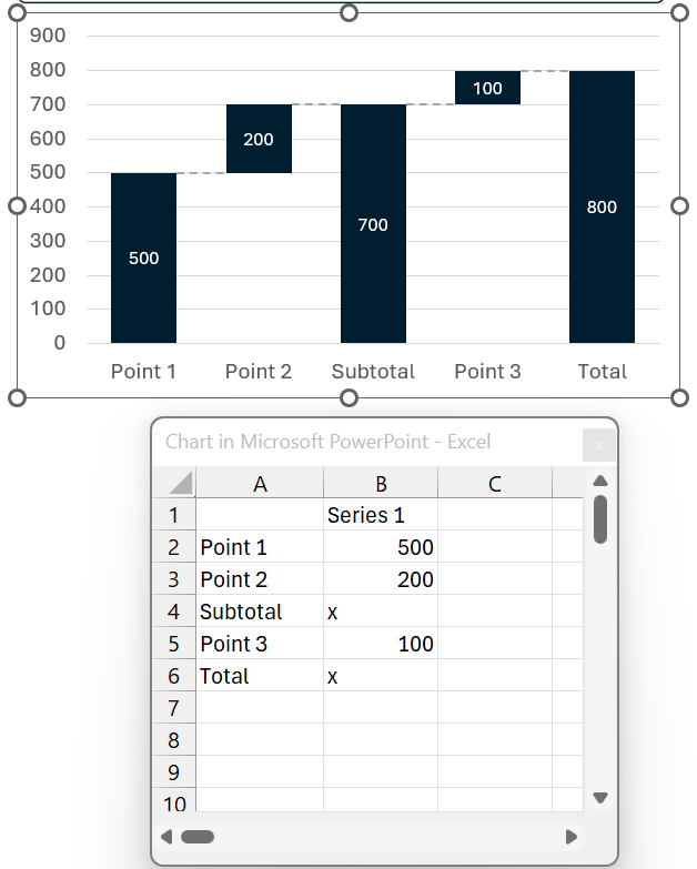
The data sheet is deliberately simple: one column of categories, one column of values. A few keywords do the rest:
| You type | You get |
|---|---|
| A number | A normal step, up or down |
| x | A total column: the running total at that position, computed for you |
| e | Exactly the same as x - a second spelling, nothing more |
| <new> | A restart: the running total goes back to zero and a second waterfall begins |
Two waterfalls in one chart
Type <new> into a value cell and the running total resets to zero. Everything after that row builds a fresh waterfall from the ground up, in the same chart and on the same axis - useful for last year beside this year, or one bridge per region.
The restart row itself plots nothing, and it does not take up a slot on the category axis: the two waterfalls sit directly next to each other rather than with an empty column between them.
Everything else - the invisible spacer series, the running totals - lives in hidden, protected helper columns and recalculates as you type.
Available as Waterfall (columns) and Waterfall Bar (horizontal). Add more value columns to build stacked or multi-series waterfalls; the chart adapts to the data.
Connectors between the steps can be toggled under Lines → Show Connector Lines.
Mekko charts
A Mekko (marimekko) encodes two dimensions: column width and segment height.
- Mekko: every column is stretched to full height. Only the widths vary, so you read the SHARE within each column and compare columns by width.
- Mekko (Units): column height carries the column total as well, so both dimensions are absolute and each cell's AREA is meaningful.
The data sheet holds one row of column names, a Width row, and one row per area. The Width row defaults to the sum of its column, so a plain Mekko works with no extra input - overwrite it if you want independent widths.
Cells are drawn by presentaid and take their colours from your chart style's palette. Recolour any individual cell with the Color Pane and the colour survives data changes - it is stored under the cell's area and column names, so it stays with the right cell when you insert or reorder rows. (Mekkos made with an earlier version keep their theme colours until you apply a chart style.)
The Width row follows the area rows, however many you add, and a blank row or column in the middle of the sheet simply plots as zero instead of cutting off everything after it. A width you type yourself is never overwritten.
Pie and doughnut charts
A pie is one series whose points are the slices, which is why it behaves differently from every other chart here: there is no category axis, no value axis and nothing to anchor an arrow to. The action bar drops what does not apply and Chart Properties hides the axis settings entirely.
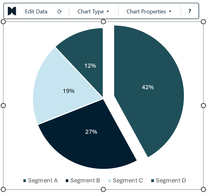
The data sheet is a single column of values with the category names beside them. A new pie arrives with percentage labels on the slices, because a pie is read as shares rather than units.
Segment spacing. The bar-width slider becomes Segment spacing on a pie: a gap in points, drawn between the slices, with the disc staying exactly where it is. A new pie starts at 2pt, which is enough to keep two neighbouring colours from running together.
Pulling one segment out. Click the slice you want to talk about, then open Chart Properties → Selected segment. The panel names the slice you clicked and its slider slides that one slice out of the disc; the others stay put. Set it back to 0 to close the pie again.
Spacing and pulling a segment out are independent - adjust one and the other stays as you set it.
Waffle charts
A waffle chart shows shares of a whole as a grid of cells - by default 10 × 10, so every cell is one percent. Each category claims its share of the cells, and whatever is left over stays grey. When the shares are small or close together it reads faster than a pie, because counting cells is easier than comparing angles.
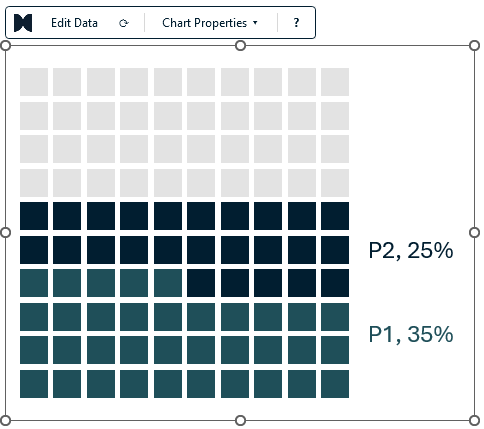
The data sheet is one column of names and one column of values. A new waffle arrives with two categories - P1 with 35 and P2 with 25 - so you can see the remainder at work. Type a new row and it becomes a new category; a blank row in between does no harm.
What the values mean. Choose under Chart Properties → Values are:
| Setting | A value of 35 means |
|---|---|
| % of the grid | 35% of the cells; the rest stays empty (the default) |
| Shares | The values are scaled so that together they fill every cell |
The cells are handed out so the counts always add up exactly: three equal thirds of a 10-cell grid become 4, 3 and 3 cells - never 3, 3 and 3.
Grid and cells. On a waffle, Chart Properties has its own section:
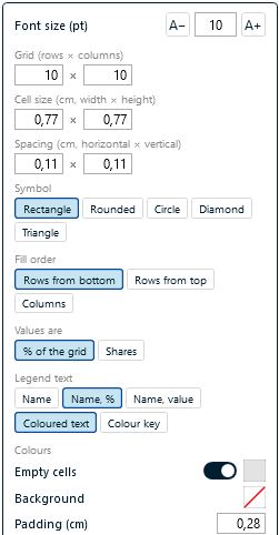
| Setting | What it does |
|---|---|
| Grid | Rows × columns, up to 50 each and 1,000 cells in total |
| Cell size | Width × height of one cell, in centimetres or inches - whichever your presentaid measurement setting uses |
| Spacing | Horizontal × vertical gap between the cells, in the same unit |
| Symbol | Rectangle, rounded rectangle, circle, diamond or triangle |
| Fill order | Rows from the bottom (the default), rows from the top, or column by column |
| Values are | % of the grid or shares - see above |
| Legend text | Name, "Name, %" or "Name, value" - as coloured text or with a colour key |
| Colours | Empty cells on or off and their colour, a background colour behind the whole chart, and the padding around the content (also in cm or inches) |
Changing a setting resizes the chart frame to fit the grid, the legend and the padding. It works the other way round too: resize the frame by hand and the cells grow or shrink to fill it, keeping their spacing and their shape - a square cell stays square. Switch the chart title on and the grid makes room below it.
Legend. The Show legend chips place the legend right, left, top or bottom, or hide it. Beside a grid that fills row by row, every entry sits level with its own band of cells. The Font size control sizes the legend text.
Colours. Categories take the colours of your chart style's palette, in order, and a style with a legend block sets the legend's position, size and colour. To give one category a different colour, click any of its cells - or its legend entry - and pick a colour in the Color Pane: all of the category's cells follow, and the colour stays with the category name when you add or reorder rows.
Scatter and bubble charts
Scatter and bubble charts plot one point per row of your data sheet:
| Column | Meaning |
|---|---|
| A | Point name (used as the label) |
| B | X value |
| C | Y value |
| D | Bubble size (bubble charts only) |
The point labels are drawn by presentaid, not by PowerPoint. They are placed by a collision-avoiding solver that keeps them off each other, off the markers and inside the plot area, and draws a thin leader line when a label has to sit further away. Bubbles are sized by area, which is the honest encoding.
Butterfly (tornado) charts
A butterfly compares two series that grow away from a shared centre line - ideal for "before vs after", "us vs them", or sensitivity analyses.
The data sheet is Category | Left | Right. Type positive numbers in both columns: presentaid mirrors the left series through a hidden helper column, formats the axis to show magnitudes, and writes the value labels itself so both sides read as positive numbers.
Labels that stay readable
Wherever presentaid puts a number on a bar, a segment or a slice, it picks black or white from that fill - so a value never disappears into a dark navy column or a pale blue one. Recolour a bar and its label follows on the spot.
Labels placed outside the bar sit on the slide, not on the colour, so they keep your theme's text colour. If you set a label colour yourself, that choice is kept: only the automatic black-or-white is ever recalculated.
On a stacked waterfall, thin segments would print their numbers on top of each other. presentaid pushes them apart along the column, moving each as little as possible and never past its neighbour, so the values stay attached to the segments they belong to. Edit a value and the labels shift slightly rather than reshuffling.