
Annotations are what turn a chart into an argument. presentaid draws them as native shapes inside the chart, positioned from the chart's real geometry - so they sit exactly on the bars, and they stay there when the numbers change.
Adding an annotation
- Select the chart and open Lines in the action bar.
- Pick Growth arrow, CAGR arrow or Difference arrow.
- Small circles appear on every possible anchor point. Click the start point, then the end point.
- The arrow is drawn with its calculated label.
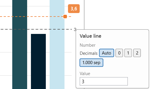
For a Value line, choose Lines → Value line. presentaid pre-fills the average of all plotted values; accept it or type your own.
Changing an existing annotation
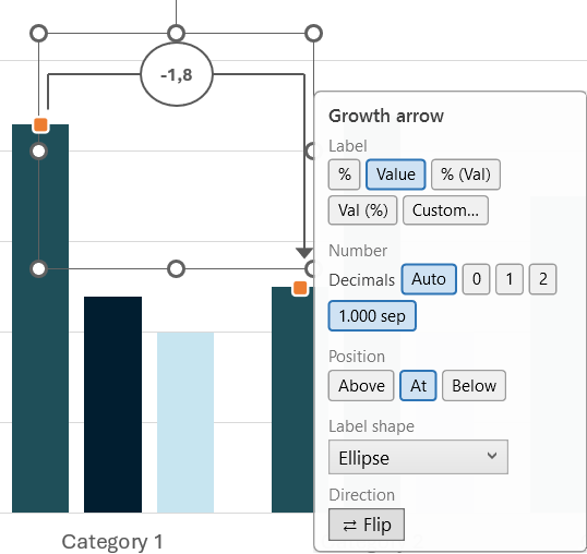
Hover over an annotation and its anchor handles appear:
- Drag a handle: re-anchors the arrow to a different bar.
- Click a handle: opens the settings panel for that annotation.
The settings panel
The panel adapts to the annotation you clicked:
| Setting | What it does |
|---|---|
| Label | Switch between %, absolute value, "% (Val)" and "Val (%)", or type a custom number format |
| Decimals | Auto, 0, 1 or 2 decimal places |
| Thousands separator | On or off |
| Position | Place the label above, at, or below the arrow |
| Label shape | Ellipse, rectangle or none |
| Flip | Reverse the arrow direction |
| Value | For value lines: the exact value the line sits at |
Percentages on a CAGR arrow
A CAGR arrow's percentage is an annualised rate, and it says so: the label reads "CAGR: +12.3%".
That distinction matters as soon as you compare it with the other options:
| Label | Over three years, 100 → 133.1 |
|---|---|
| % | CAGR: +10.0% - the annual rate |
| % (Val) | CAGR: +10.0% with the absolute change underneath |
| Δ% (Val) | +33.1% with the absolute change underneath - the TOTAL change over the span |
| Custom… | Formats the total change, never the annual rate |
Δ% (Val) appears on CAGR arrows only. On a growth or difference arrow the percentage is already the total change, so the option would be an exact duplicate of "% (Val)".
Custom number formats
Choose Custom… and you get a dropdown you can also type into. Each ready-made entry shows exactly what it renders for a positive and a negative value, in your own decimal separator.
Formats follow the standard Windows pattern of positive;negative;zero sections. The catch worth knowing: any literal text has to be repeated in every section. Write "Total: +0.0%" on its own and a negative value comes out as "-Total: 10.0%", with the minus sign in front of the words. Write "Total: +0.0%;Total: -0.0%" and it reads correctly.
Dragging a value line
A value line carries an orange handle. Drag it and the line follows your cursor, with a dashed preview across the plot and the value shown in a chip next to the pointer. Release to commit.
The plot makes room automatically
When an annotation needs space - a growth arrow above the tallest column, a value line label beside the plot - presentaid shrinks the plot area so the annotation never overlaps the data. Delete the annotation and the plot returns to its original size.
Styling
Every annotation is a normal PowerPoint shape. Recolour it, change the line weight, set a different font - your styling survives every re-render, including data changes.