Add/Delete Columns
To add a column you can simply click on the column header in the task pane. presentaid will guess the most suitable column type based on the underlying data.
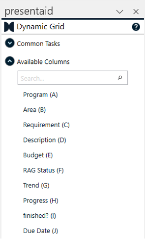
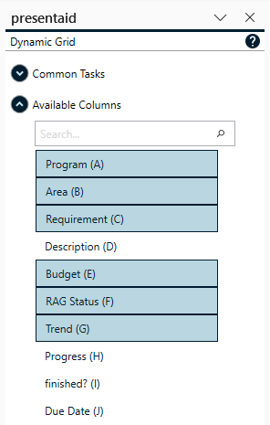
To remove a column select a shape of that column and delete it. The Dynamic Grid will notice this change and remove the entire column.
Column Configuration
Grouping of Columns
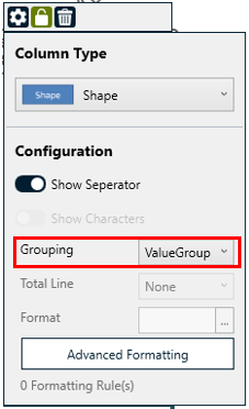
The grouping parameter helps to visually connect data rows with the same value. The Grouping logic can be changed in the taskpane.
Let's assume we have the following data snippet:
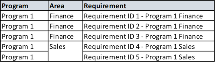
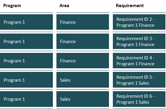
If we apply "No Grouping", the Dynamic Grid will generate a shape for each cell:
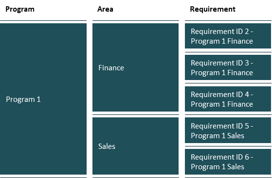
If you apply "ValueGrouping" to the first and second column the result looks as follows:
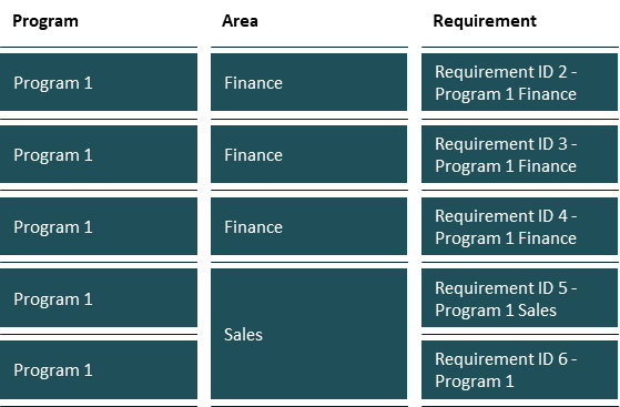
If you apply "ExcelGrouping" to the first and second column the grouping is based on merged cells in Excel:
Change Column Type
To change the column type select a cell of the column that you'd like to change. In the dropdown above the column you can select your preferred column type.
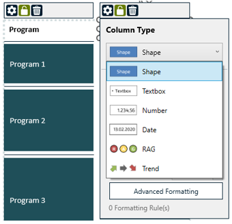
Available Column Types
presentaid offers a range of column types so you can display each column in the most meaningful way:
| Type | What it shows | Sample |
|---|---|---|
| Textbox | Plain text - the raw cell value |  |
| Number | A number, with an optional number format and total line |  |
| Date | A date, with a configurable date format |  |
| Shape | A colored shape (e.g. a status dot) per cell |  |
| RAG | Red / Amber / Green status indicators |  |
| Harvey Ball | Harvey Balls for 0-100% completion |  |
| Progressbar | A horizontal progress bar, value shown as % | 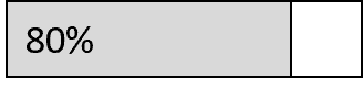 |
| Bar Chart | A horizontal bar whose length is proportional to the value | 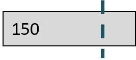 |
| Rating | A star rating (e.g. 3.5 of 5 stars) |  |
| Slider | A slider knob positioned along a track |  |
| Checkbox | A checked / unchecked box |  |
| Flag | A flag icon to mark rows |  |
| Trend | An up / down / neutral trend arrow |  |
Some column types have their own options in the header menu once they are selected:
- Bar Chart - set the Maximum (the value that represents a full bar) and an optional Target marker.
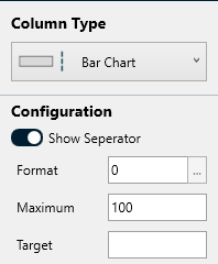
Bar Chart Options - Rating - choose the number of stars, whether the source value is read as a percentage (0-100% of the stars) or as an absolute star count (e.g. 3.5), and whether partially filled stars are shown exactly or rounded to whole stars.
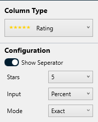
Rating Options
Add a Total Line
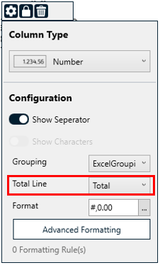
For Number Columns you can add a total line at the bottom of the Dynamic Grid. You can either show the sum or the average of the column.
Change the Format of Number and Date Columns
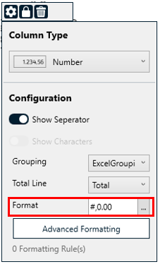
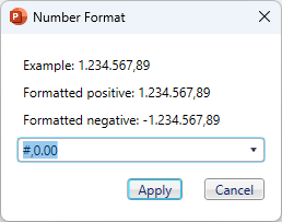
In case you want to change the display format of a number or date column, select a shape in the column that you'd like to change and open the "Format" box in the taskpane.
Conditional Format
With the conditional format you can add additional styles based on the content of a cell in the Dynamic Grid. Let's assume you have created the following Grid and you want to change the background color of the "Sales" items in the second column:
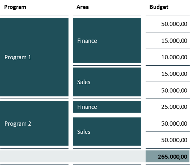
- Select that column for which you want to apply a conditional format
- Click on "Advanced Conditional Formatting" in the header menu
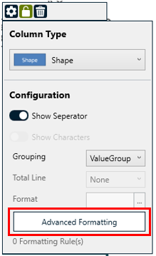
Advanced Formatting - Add a Rule, e.g. Value is equal to "Sales" and define your style, e.g. a grey background
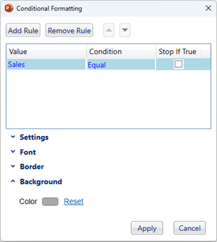
Conditional Format - The conditional format will now be applied to all cells in the column which match the rule.
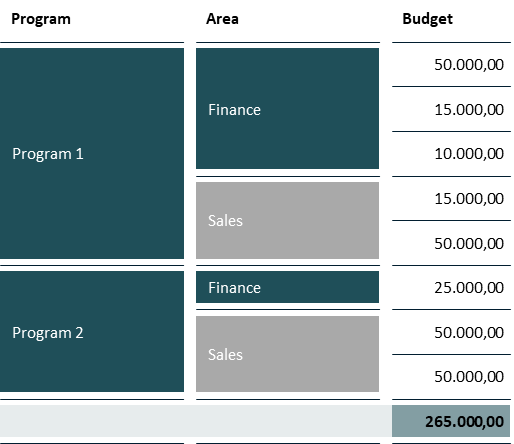
Conditional Format Post
Grid Configuration
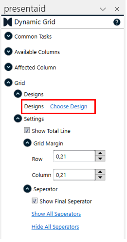
Designs
With Designs you can apply different layout styles to the entire Dynamic Grid. This is useful if you want to apply different styles for different clients or if you have different reporting formats within your company.
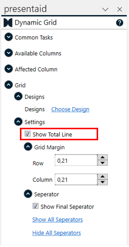
Total Line
Enable or disable the total line of the Dynamic Grid.
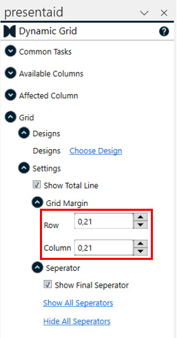
Grid Margin
The margin defines the space between the columns and rows of the Dynamic Grid.
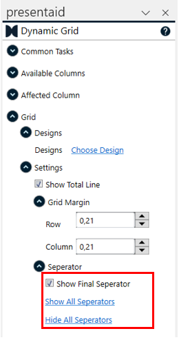
Separator
The separators are the lines between each row of the Dynamic Grid. You can enable/disable them column by column or use this global configuration in the Grid settings pane.
Stripes
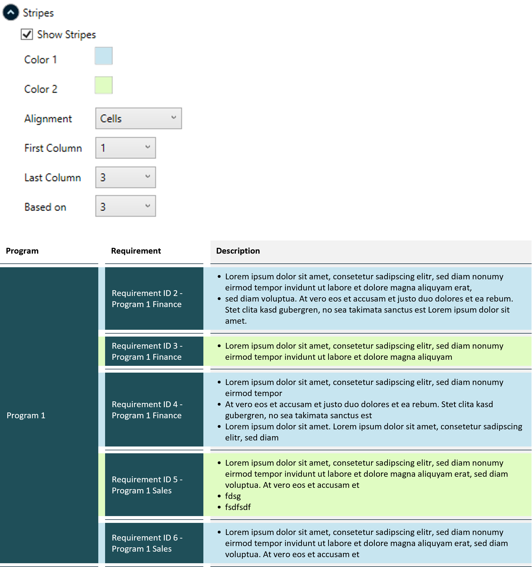
Stripes are alternating full-width color bands drawn behind the rows to make the grid easier to read.
- Show Stripes - turn striping on or off.
- Color 1 / Color 2 - the two colors the bands alternate between.
- Alignment - whether the bands align to the Separator lines or to the Cells.
- First Column / Last Column - the range of columns the stripes span.
- Based on - the column that decides where a new band starts. For a grouped column you get one band per group (e.g. one band per Program); for a non-grouped column the stripes fall back to a classic per-row zebra. Defaults to the last column.
Background
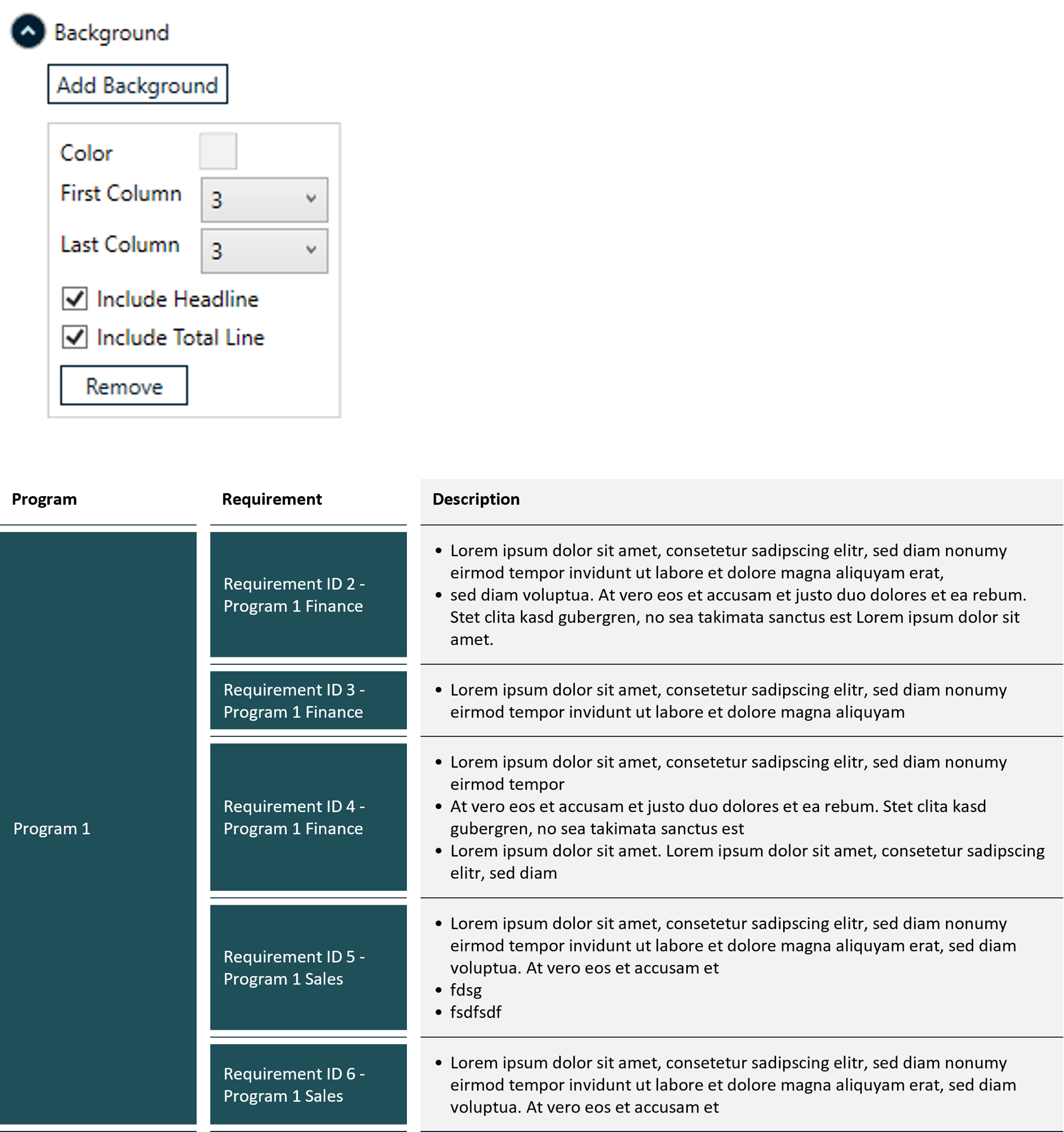
A background is a solid color band drawn fully behind the grid - useful to highlight a block of columns.
- Click Add Background.
- Pick the Color and the First Column / Last Column the band should span.
- Optionally tick Include Headline and/or Include Total Line to extend the band over the header row and the total line.
You can add several backgrounds and Remove any of them again.
Custom Placeholders
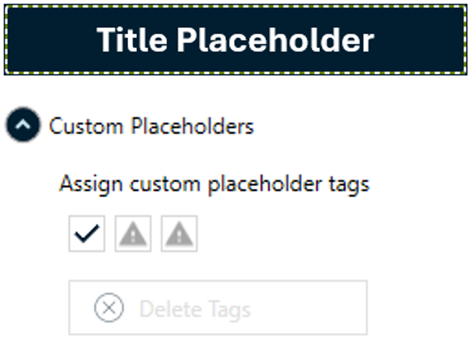
Custom placeholders let you mark extra shapes - such as a Title, Subtitle or Footnote - as part of the grid template, so they travel with it and are kept whenever the grid is saved (with Additional Shapes) and rendered.
- Select the shape you want to tag.
- Under Assign custom placeholder tags, click Title, Subtitle or Footnote.
- To remove a tag again, select the shape and click Delete Tags.