
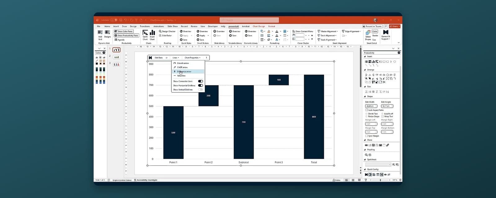
A waterfall chart (also called a bridge chart) shows how you get from a starting value to an end value through a series of positive and negative steps - revenue from last year to this year, budget to actual, headcount from January to December. In PowerPoint you can build one with the built-in Waterfall chart type (PowerPoint 2016 and later, including Microsoft 365) or with an add-in such as presentaid, which calculates subtotals for you and adds CAGR and difference arrows.
What a Good Waterfall Chart Needs
Before you build anything, get the data shape right. A waterfall needs:
- A start value - the full bar on the left (e.g. revenue 2025).
- The steps in between - each one an increase or a decrease (price effect, volume effect, new customers, churn).
- Subtotals where they help - for example after all operating effects, before one-offs.
- An end value - the full bar on the right (revenue 2026).
The most common mistake is too many steps. Seven to nine bars are readable; twenty are not. Group small effects into "Other" and explain them in a footnote.
Option 1: The Built-in PowerPoint Waterfall Chart
- Go to Insert → Chart and choose Waterfall.
- PowerPoint opens a small data sheet. Enter your categories in the first column and the values in the second: the start value, then the steps (positive or negative numbers), then the end value.
- The start and end values are now drawn as floating steps. To fix that, click the start bar once, then click it again to select only that bar, right-click it and choose Format Data Point → Set as total. Repeat for the end bar and every subtotal.
- Adjust colors for increases, decreases and totals via the legend entries, and add data labels if they are missing.
This works, but has limits you will notice in day-to-day use:
- You must calculate subtotals yourself. "Set as total" only tells PowerPoint to draw a bar from zero - the value in the sheet has to be the correct running total. If a step changes, every subtotal after it has to be updated by hand.
- No growth or CAGR arrows. Annotations like "+12% CAGR" or "Δ -3.4m vs. budget" have to be drawn as separate shapes and moved manually whenever the numbers change.
- Limited layout control. The built-in waterfall uses a newer chart engine that offers fewer formatting options than classic PowerPoint charts.
On PowerPoint 2013 and older there is no waterfall type at all; the workaround is a stacked column chart with an invisible base series - which is exactly as fiddly as it sounds.
Option 2: Waterfall Charts with presentaid
presentaid adds a waterfall chart that does the arithmetic for you. The result is still a native PowerPoint chart, so colleagues without the add-in can open and edit it.
- In the presentaid ribbon, click Insert Chart in the Charts group. The chart picker opens at your mouse pointer.
- Choose Waterfall (or Waterfall Bar for horizontal bars).
- Click on the slide to insert it centred, drag a rectangle to place it exactly, or select an existing placeholder shape first - the chart then replaces it at the same position and size.
- The data sheet opens automatically. Enter one column of categories and one column of values.
- For every total or subtotal, type x (or e) instead of a number. presentaid calculates the running total at that position - change a step, and every subtotal follows.
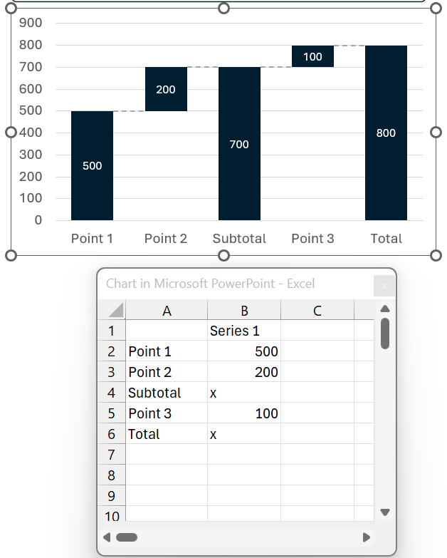
Two more things that save time:
- Two waterfalls in one chart: type <new> in a value cell and the running total restarts at zero - useful for "last year vs. this year" or one bridge per region on the same axis.
- Connector lines between the steps can be switched on or off under Lines → Show Connector Lines in the action bar.
Add a CAGR or Difference Arrow
Annotations are what turn a chart into an argument. With presentaid:
- Select the chart and open Lines in the action bar.
- Choose Growth arrow, CAGR arrow or Difference arrow.
- Click the start bar, then the end bar. The arrow is drawn with its calculated label.
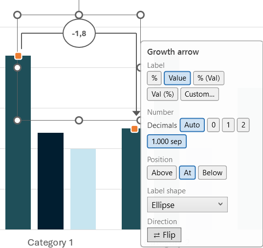
Because the arrow is anchored to the bars, it moves and recalculates when the numbers change - no more stale "+8%" labels in next quarter's deck. Note the difference between the two percentages: a CAGR arrow shows the annualised growth rate, a growth arrow shows the total change across the span.
Tips for Waterfalls That Convince
- Sort the steps by logic, not by size. Follow the story: operating effects first, then one-offs, then currency.
- Use color sparingly. One color for increases, one for decreases, a neutral one for totals. Don't color-code every bar.
- Label every bar. A waterfall without data labels forces the audience to estimate.
- Put the message in the headline. "Price increases more than offset volume loss" says more than "Revenue bridge 2025-2026".
FAQ
Which PowerPoint versions have a waterfall chart?
The built-in waterfall chart type is available in PowerPoint 2016 and later, including Microsoft 365. Older versions need a stacked-column workaround or an add-in.
Can colleagues without presentaid edit the chart?
Yes. presentaid creates native PowerPoint charts. Colleagues can open the deck and edit the data in any standard PowerPoint installation.
Can I build a waterfall chart from an Excel file?
In PowerPoint you type or paste the data into the chart's data sheet. With presentaid you can also link charts to an Excel range and refresh them when the workbook changes - see Excel-linked charts.
More on presentaid's chart tools: PowerPoint charts · Guide: waterfall, Mekko and other chart types