
Der Chart Style Configurator definiert Chart-Stile: welche Einstellungen ein Chart erhalten soll - Serienfarben, Schriften, Achsen, Legende und mehr -, damit niemand den Hausstil auf jeder Folie von Hand erneut anwenden muss.
Du kannst mehrere Stile nebeneinander anlegen - zum Beispiel ein Farbmuster für Ist-Werte und eines für Prognosen oder eine helle und eine dunkle Variante - und einen davon als Standard markieren. Jedes neue Chart erhält den Standard-Stil, und jeder andere Stil ist nur einen Klick entfernt.
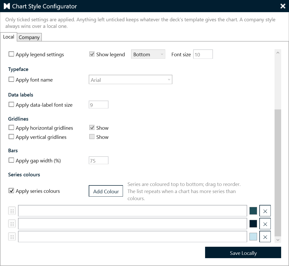
Öffnen
presentaid-Ribbon → About → Expert Tools → Chart Style Configurator.
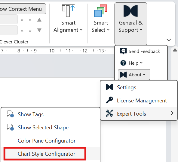
Mehrere Stile
Die Liste Styles im Configurator enthält alle deine Stile. Wähle einen Stil in der Liste aus, um seine Einstellungen zu bearbeiten.
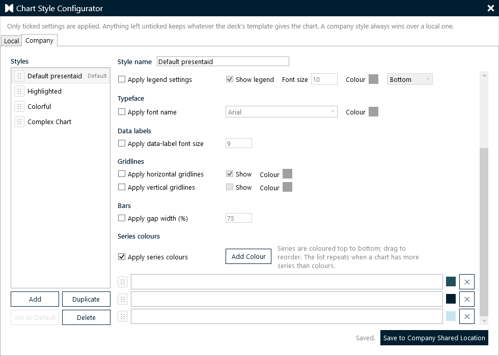
- Add: legt einen neuen, leeren Stil an.
- Duplicate: kopiert den ausgewählten Stil - der schnellste Weg zu einer Variante, die sich zum Beispiel nur in den Farben unterscheidet.
- Delete: entfernt den ausgewählten Stil.
- Set as Default: macht den ausgewählten Stil zum Standard. Er ist in der Liste mit Default markiert. Neue Charts erhalten den Standard-Stil, und Apply Style im Ribbon wendet ihn mit einem Klick an.
- Style name: erscheint im Ribbon und in Chart Properties - wähle also Namen, die deine Kolleginnen und Kollegen verstehen, etwa "Ist", "Prognose" oder "Wettbewerb".
- Ziehe einen Stil nach oben oder unten, um die Liste neu zu ordnen. In dieser Reihenfolge werden die Stile beim Anwenden angeboten.
Die wichtigste Regel: alles ist Opt-in
Jeder Block im Formular hat sein eigenes "Apply …"-Häkchen, und alles rechts davon bleibt ausgegraut, bis du es aktivierst.
Ein Block, den du nicht aktivierst, wird überhaupt nicht angefasst - das Chart behält, was ihm das Template deines Decks vorgibt. Das ist Absicht und nicht dasselbe wie die Einstellung auszuschalten:
| Was du einstellst | Was mit einem neuen Chart passiert |
|---|---|
| "Apply title settings" nicht aktiviert | Der Titel bleibt genau so, wie das Template ihn gemacht hat |
| "Apply title settings" aktiviert, "Show title" nicht aktiviert | Der Titel wird aktiv AUSGESCHALTET |
Was du definieren kannst
Jeder Stil hat seine eigenen Blöcke:
| Abschnitt | Einstellungen |
|---|---|
| Title | Anzeigen oder ausblenden, Schriftgröße |
| Value axis (Y) | Anzeigen oder ausblenden, Schriftgröße, Zahlenformat |
| Category axis (X) | Anzeigen oder ausblenden, Schriftgröße |
| Legend | Anzeigen oder ausblenden, Position, Schriftgröße |
| Typeface | Eine Schriftart für jedes Textelement im Chart |
| Data labels | Schriftgröße |
| Gridlines | Horizontal und vertikal, unabhängig voneinander |
| Bars | Abstandsbreite in % |
| Series colours | Eine geordnete, sich wiederholende Palette |
Series colours
Die Palette ist eine einfache geordnete Liste - Serie 1 erhält die erste Farbe, Serie 2 die zweite, und so weiter. Hier gibt es bewusst keine Gruppierung, anders als beim Color Pane: In einem Chart ist die REIHENFOLGE die Bedeutung.
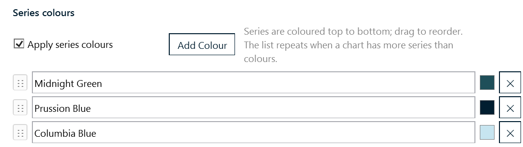
- Add Colour: fügt eine Zeile hinzu.
- Klicke auf die Farbfläche, um dieselbe Farbauswahl zu öffnen, die überall in presentaid verwendet wird.
- Ziehe den Griff ⋮⋮, um die Reihenfolge zu ändern; eine blaue Linie zeigt, wo die Zeile landen wird.
- Hat ein Chart mehr Serien, als du Farben definiert hast, wiederholt sich die Liste von vorne.
- Bei einem Kreis- oder Ringdiagramm färbt die Palette die Segmente, da ein Kreisdiagramm eine einzelne Serie ist.
- Bei einem Mekko färbt sie die Flächen, bei einem Waffeldiagramm die Kategorien - in der Reihenfolge, in der sie im Datenblatt stehen.
Wenn du keine Palette definierst
Farben sind die einzige Einstellung mit einem Fallback. Ein über presentaid eingefügtes Chart ohne konfigurierte Palette erhält die presentaid-Hausfarben - ein tiefes Marineblau, ein Petrol, ein blasses Blau und ein blasses Grün - statt der Akzentfarben, die dein Deck-Theme zufällig mitbringt. So ist ein presentaid-Chart auf einen Blick erkennbar.
Definierst du eine Palette, gewinnt sie; deaktivierst du Series colours, kommen die Hausfarben zurück. Jeder andere Block verhält sich wie zuvor: nicht aktiviert heißt nicht angefasst.
Später hinzugefügte Serien
Wenn du zu einem bestehenden Chart eine Serie hinzufügst - über Edit Data, oder weil ein verknüpfter Excel-Bereich gewachsen ist - erstellt PowerPoint sie in einer Themenfarbe, und das Chart hat am Ende einen Balken, der nicht passt.
presentaid färbt diese neue Serie beim nächsten Auswählen des Charts aus der Palette. Jede Serie erhält die Farbe, die ihrer Position zusteht, sodass das Hinzufügen einer Serie die bereits auf der Folie vorhandenen Farben nie durcheinanderbringt.
Jedes Chart merkt sich, welcher Stil ihm zugewiesen wurde. Ein Chart im Stil "Prognose" erhält neue Serien in den Prognose-Farben, nicht in denen des Standard-Stils. Wird dieser Stil später gelöscht, fällt das Chart auf den Standard-Stil zurück.
Local- und Company-Styles
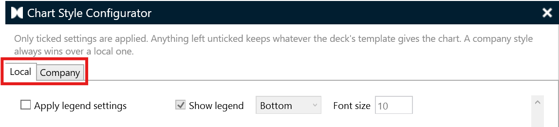
- Local: deine eigenen Stile, gespeichert in deinem persönlichen presentaid-Ordner. Immer verfügbar.
- Company: die gemeinsamen Stile, gespeichert in der Company Library. Der Tab erscheint nur, wenn eine Company Library verbunden ist und du Schreibzugriff darauf hast.
Alle Stile eines Speicherorts liegen in einer einzigen Datei namens chartstyle.xml, entweder in deinem lokalen presentaid-Ordner oder im Stammverzeichnis der Company Library. Fehlt sie oder ist sie nicht lesbar, verhält sich presentaid einfach so, als wäre kein Stil konfiguriert - Charts behalten PowerPoints eigene Standardwerte, abgesehen von der oben beschriebenen Hausfarbpalette.
Wann ein Stil angewendet wird
Automatisch, jedes Mal, wenn du ein Chart über presentaid einfügst - mit dem Standard-Stil.
Bei den konstruierten Diagrammtypen - Wasserfall, Mekko, Kreis, Waffel-, Streu-, Blasen-, Schmetterlingsdiagramm - wird der Stil nach dem Aufbau des Charts angewendet, und die Konstruktion gewinnt, wo beide sich widersprechen. Ein Mekko oder ein Waffeldiagramm hat beispielsweise absichtlich keine Achsen, sodass ein Stil, der eine sichtbare Wertachse verlangt, diese nicht zurückbringt, und ein Kreisdiagramm ignoriert aus demselben Grund die Achsen- und Gitterlinien-Blöcke. Bei einem Waffeldiagramm legt der Legenden-Block des Stils Position, Größe und Farbe der eigenen Legende des Waffeldiagramms fest.
Serien, die absichtlich unsichtbar sind, werden nie eingefärbt: Die Abstandsreihe eines Wasserfalls und die Canvas-Fläche hinter einem Mekko oder einem Waffeldiagramm tragen Struktur, keine Farbe, und sie einzufärben würde einen Phantombalken hinter dein Chart legen.
Manuell, jederzeit - wähle ein Chart aus und nutze eine von zwei Stellen:
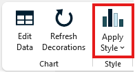
- Ribbon: Klicke im Tab presentaid Charts auf Apply Style, um den Standard-Stil anzuwenden, oder öffne die Liste, um einen beliebigen Stil zu wählen. Der Standard-Stil steht oben und ist mit "(default)" markiert; die übrigen folgen in der Reihenfolge deiner Liste.
- Chart Properties: Öffne Chart Properties in der Aktionsleiste. Der Abschnitt Chart style listet jeden Stil auf - den Standard-Stil zuerst, jede Zeile in den Farben des jeweiligen Stils. Klicke auf einen Stil, um ihn anzuwenden.
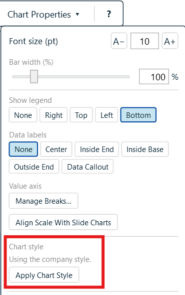
Der Abschnitt Chart style zeigt dir auch, welche Stile aktiv sind - "Using the company styles" oder "Using your local styles" - was der schnellste Weg ist zu verstehen, warum eine lokale Änderung scheinbar keine Wirkung hatte. Ist noch kein Stil eingerichtet, sagt er dir das und verweist auf About → Expert Tools.