
Achsenunterbrechungen
Wenn ein Wert alle anderen überragt, flacht eine normale Achse alles andere auf null ab. Eine Achsenunterbrechung (Axis Break) blendet einen leeren Abschnitt der Wertachse aus, sodass die kleinen Werte lesbar bleiben und der Ausreißer trotzdem hineinpasst.
- Wähle das Chart aus und öffne Chart Properties → Manage Breaks.
- Gib den Bereich ein, den du ausblenden möchtest (von / bis), und bestätige.
- presentaid zeichnet das Chart durch die Unterbrechung neu, zeichnet die Bruchmarkierungen auf der Achse und beschriftet die Achse neu mit den echten Werten.
Skala mit Folien-Charts abgleichen
Zwei Charts nebeneinander sind nur vergleichbar, wenn sie sich eine Skala teilen. Chart Properties → Align Scale With Slide Charts wendet in einem einzigen Undo-Schritt das größte gemeinsame Minimum und Maximum über alle Charts hinweg an.
Der Umfang hängt von deiner Auswahl ab:
- Ein Chart ausgewählt: jedes geeignete verwaltete Chart auf der Folie wird ausgerichtet.
- Zwei oder mehr Charts ausgewählt: nur diese Charts werden ausgerichtet.
Diese zweite Regel ist wichtig: Eine Folie enthält oft nicht zusammengehörige Charts, und ein Umsatz-Chart und ein Headcount-Chart auf eine Skala zu zwingen würde beide flach machen. Wähle die aus, die zusammengehören.
Alle Dekorationen auf den betroffenen Charts werden bei der neuen Skala neu gerendert, sodass Pfeile weiterhin ihre Balken berühren.
Chart Properties
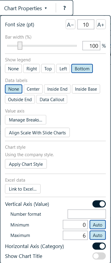
| Abschnitt | Was du einstellen kannst |
|---|---|
| Font size | Eine Einstellung für jedes Textelement im Chart |
| Bar width | Der Abstand zwischen Balken, in Prozent |
| Show legend | Keine, rechts, oben, links oder unten |
| Data labels | Keine, Mitte, innen Ende, innen Basis, außen Ende oder Daten-Callout |
| Waffle | Nur bei Waffeldiagrammen: Raster, Zellgröße, Abstand, Symbol, Füllreihenfolge, Werte, Legendentext und Farben |
| Value axis | Manage Breaks, Align Scale |
| Chart style | Jeder eingerichtete Stil, Standard zuerst - ein Klick wendet ihn an |
| Excel data | Verknüpfung zu einer externen Arbeitsmappe ändern, aktualisieren oder entfernen |
| Vertical / Horizontal axis | Anzeigen oder ausblenden, Zahlenformat, festes Minimum und Maximum |
| Show chart title | Ein oder aus |
Setze ein Minimum oder Maximum, um die Achse zu fixieren; klicke auf Auto, um die Kontrolle wieder an PowerPoint zurückzugeben.
Das Ausklappmenü zeigt nur, was das ausgewählte Chart tatsächlich nutzen kann. Bei einem Kreis- oder Ringdiagramm sind die Achseneinstellungen, die Unterbrechungen und die Skalenausrichtung alle verschwunden - ein Kreisdiagramm hat keine Achsen - und der Balkenbreiten-Regler wird zu Segment spacing mit einem Selected segment-Regler darunter. Ein Ringdiagramm bietet bei Datenbeschriftungen nur "None" und "Centre" an, da PowerPoint einem Ringdiagramm keine weiteren Beschriftungspositionen zur Auswahl gibt. Bei einem Waffeldiagramm weichen Balkenbreite, Datenbeschriftungen und Achseneinstellungen dem eigenen Abschnitt des Waffeldiagramms - siehe Waffeldiagramme.