
Anmerkungen machen aus einem Chart ein Argument. presentaid zeichnet sie als native Formen innerhalb des Charts, positioniert anhand der echten Geometrie des Charts - sodass sie exakt auf den Balken sitzen und dort bleiben, wenn sich die Zahlen ändern.
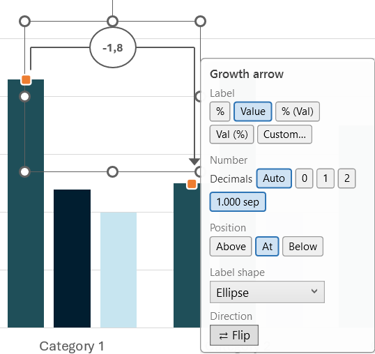
Eine Anmerkung hinzufügen
- Wähle das Chart aus und öffne Lines in der Aktionsleiste.
- Wähle Growth arrow, CAGR arrow oder Difference arrow.
- An jedem möglichen Ankerpunkt erscheinen kleine Kreise. Klicke den Start-Punkt, dann den End-Punkt an.
- Der Pfeil wird mit seiner berechneten Beschriftung gezeichnet.
Für eine Value line wähle Lines → Value line. presentaid schlägt den Durchschnitt aller geplotteten Werte vor; übernimm ihn oder gib deinen eigenen Wert ein.
Eine bestehende Anmerkung ändern
Fahre mit der Maus über eine Anmerkung, und ihre Anker-Griffe erscheinen:
- Einen Griff ziehen: verankert den Pfeil neu an einem anderen Balken.
- Einen Griff anklicken: öffnet das Einstellungspanel für diese Anmerkung.
Das Einstellungspanel
Das Panel passt sich der angeklickten Anmerkung an:
| Einstellung | Was sie bewirkt |
|---|---|
| Label | Wechsle zwischen %, absolutem Wert, "% (Val)" und "Val (%)", oder gib ein eigenes Zahlenformat ein |
| Decimals | Auto, 0, 1 oder 2 Nachkommastellen |
| Thousands separator | Ein- oder ausschalten |
| Position | Beschriftung über, auf oder unter dem Pfeil platzieren |
| Label shape | Ellipse, Rechteck oder keine |
| Flip | Pfeilrichtung umkehren |
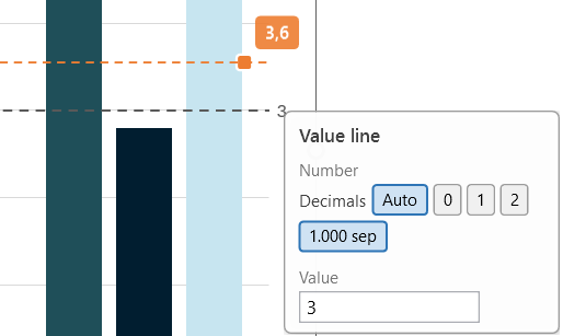
| Value | Bei Wertlinien: der genaue Wert, an dem die Linie liegt |
Prozentwerte bei einem CAGR-Pfeil
Der Prozentwert eines CAGR-Pfeils ist eine annualisierte Rate, und das sagt die Beschriftung auch: sie lautet "CAGR: +12,3%".
Dieser Unterschied ist wichtig, sobald du ihn mit den anderen Optionen vergleichst:
| Label | Über drei Jahre, 100 → 133,1 |
|---|---|
| % | CAGR: +10,0% - die jährliche Rate |
| % (Val) | CAGR: +10,0% mit der absoluten Änderung darunter |
| Δ% (Val) | +33,1% mit der absoluten Änderung darunter - die GESAMTE Änderung über den Zeitraum |
| Custom… | Formatiert die Gesamtänderung, nie die jährliche Rate |
Δ% (Val) erscheint nur bei CAGR-Pfeilen. Bei einem Wachstums- oder Differenzpfeil ist der Prozentwert bereits die Gesamtänderung, weshalb diese Option ein exaktes Duplikat von "% (Val)" wäre.
Benutzerdefinierte Zahlenformate
Wähle Custom…, und du erhältst ein Dropdown, in das du auch selbst tippen kannst. Jeder vorgefertigte Eintrag zeigt genau, was er für einen positiven und einen negativen Wert ausgibt, in deinem eigenen Dezimaltrennzeichen.
Formate folgen dem gängigen Windows-Muster aus positiv;negativ;null-Abschnitten. Der Haken dabei: Jeglicher Text muss in jedem Abschnitt wiederholt werden. Schreibst du "Total: +0.0%" allein hin, kommt bei einem negativen Wert "-Total: 10.0%" heraus - mit dem Minuszeichen vor dem Text. Schreibst du "Total: +0.0%;Total: -0.0%", wird es korrekt gelesen.
Eine Wertlinie verschieben
Eine Wertlinie hat einen orangefarbenen Griff. Ziehe ihn, und die Linie folgt deinem Cursor, mit einer gestrichelten Vorschau über dem Diagramm und dem Wert in einem Chip neben dem Zeiger. Lass los, um zu übernehmen.
Das Plot macht automatisch Platz
Wenn eine Anmerkung Platz benötigt - ein Wachstumspfeil über der höchsten Säule, eine Wertlinien-Beschriftung neben dem Diagramm - verkleinert presentaid den Plotbereich, damit die Anmerkung die Daten nie überlappt. Lösche die Anmerkung, und der Plot kehrt zu seiner ursprünglichen Größe zurück.
Styling
Jede Anmerkung ist eine normale PowerPoint-Form. Färbe sie um, ändere die Linienstärke, wähle eine andere Schriftart - dein Styling übersteht jedes erneute Rendering, auch bei Datenänderungen.