

The Slide Everyone Actually Looks At
In most business presentations there is one slide the room genuinely studies. It is rarely the agenda, and almost never the summary. It is the chart.
A chart is where an argument becomes checkable. Your audience stops listening to the narrative for a moment and starts testing it: does the trend really go that way, is the gap really that big, is the outlier explained. Whatever they conclude in those few seconds tends to stick for the rest of the meeting.
Which makes it remarkable how casually most charts are produced. They are pasted from a spreadsheet in the last hour before the deadline, kept at default settings, and handed to the audience with the implicit instruction: *you figure out what matters here*.
Convincing Charts Make One Point, Clearly
There is no shortage of chart theory. In practice, almost all of it collapses into a single rule: a chart should make one point, and the design should be in service of that point. Everything that does not help the reader reach it is noise - and noise is not neutral, it actively costs you credibility.
Two failure patterns account for most of the damage.
When the axis quietly distorts the picture
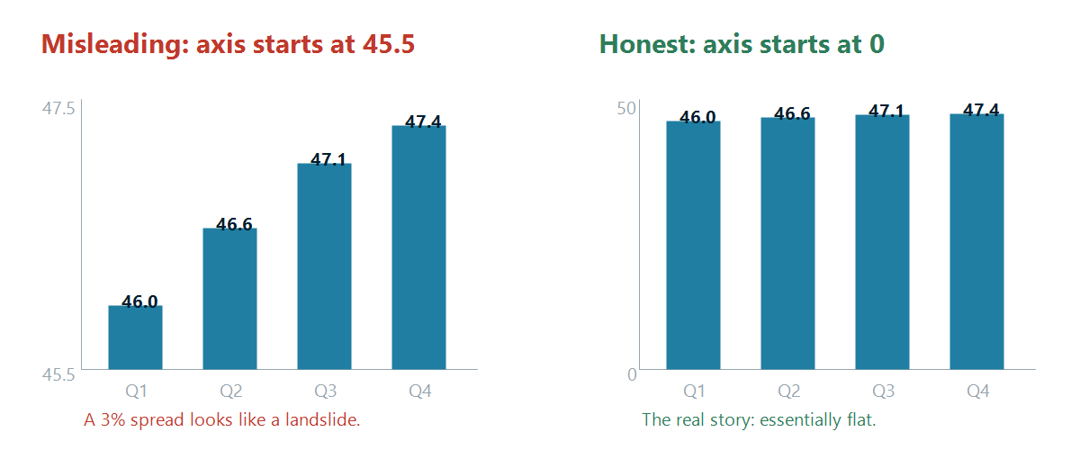
The chart on the left is technically accurate. Every number is correct. But by starting the value axis at 45.5 instead of 0 - with no visual signal that the scale has been interrupted - a spread of roughly three percent is stretched into what looks like a dramatic climb. The chart on the right shows the same four numbers honestly: the metric is essentially flat.
Silent axis truncation is the single most common way business charts mislead - usually by accident, because a charting tool auto-scaled and nobody questioned it. The problem is that if anyone in the room notices, you do not just lose the point. You lose the benefit of the doubt on every other number in the deck.
The rule: for bar and column charts, start the value axis at zero unless there is a genuine reason to zoom in on a narrow band of values. When you do need to show detail within a tight range - small changes on a large base, for example - use a clearly marked axis break. A visible break symbol tells the reader that the scale was interrupted deliberately, making the zoom honest rather than hidden. That is the difference between misleading an audience and giving them the full picture.
Bad example 2: the chart that makes the audience do the work
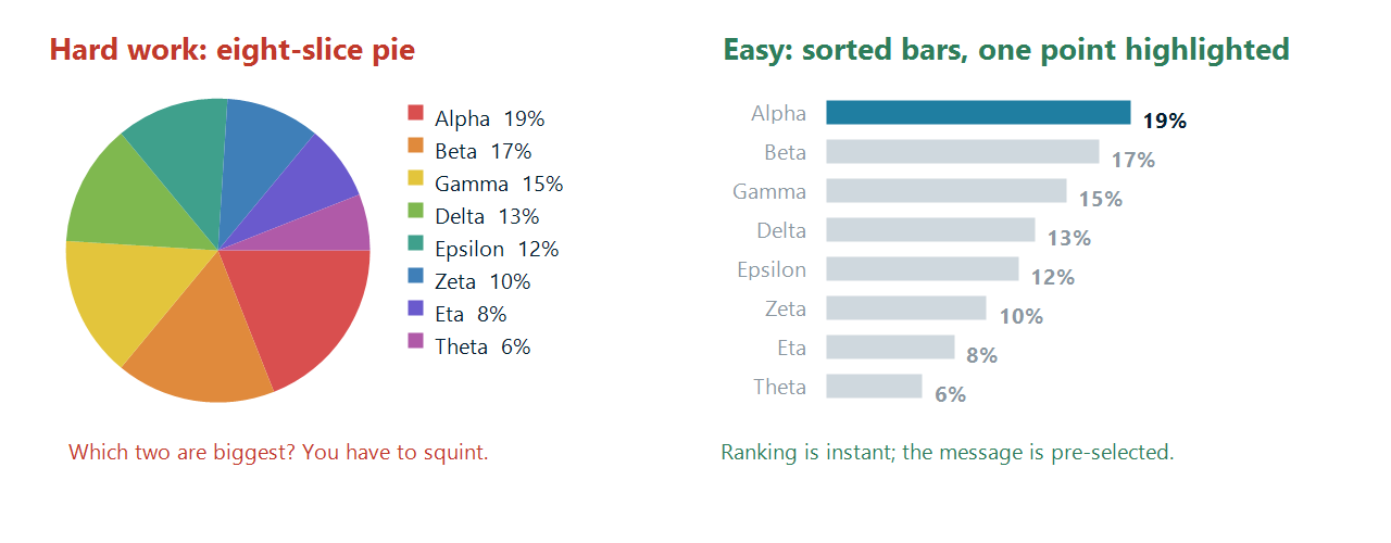
The pie on the left is a common sight. Eight slices, eight colours, a legend off to the side. To answer the simplest possible question - which two categories are the largest? - the reader has to compare angles, then map colours to a legend, then hold the results in their head.
The bar chart on the right answers that question before it is asked. The categories are sorted, the values are on the bars, and the one that matters is the only one in colour. Human perception judges length far more accurately than angle, which is why a sorted bar chart beats a pie chart in almost every business context.
The colour choice is doing real work here too. Colour should encode meaning, not decoration. Eight arbitrary colours communicate nothing except that the tool had eight defaults. One accent colour against a muted background communicates *look here*.
The upgrade: annotate the insight
Even a well-built chart still leaves the last step to the audience. The strongest business charts close that gap explicitly:
- a growth arrow between two columns, labelled with the delta
- a CAGR arrow spanning the period, so nobody has to compute the compound rate
- a difference arrow between plan and actual
- a value line marking the target, the break-even point, or last year's level
- a title that states the finding, not the subject: "Margin recovered to 2024 levels in Q3" beats "Margin development"
None of these add data. They add interpretation - which is exactly what you are in the room to provide.
The Part Nobody Talks About: Charts Change
Here is the uncomfortable truth about presentation charts. The version you build first is almost never the version you present.
The numbers land late. Finance revises a figure. A reviewer asks to see the same view excluding one region. Someone wants the last three quarters instead of the last four. The meeting slips a week and the actuals are updated in the meantime.
For a plain chart, that is fine - you edit the data and PowerPoint redraws it. But the moment you have *annotated* the chart in the way described above, an update becomes a small demolition project. The arrows were positioned by hand, so they now point at the wrong bars. The value line was a drawn shape, so it sits at the wrong height. The labels are text boxes containing hard-typed numbers that are now wrong - and worse, they are wrong but still perfectly legible, which is the most dangerous kind of wrong in a client meeting.
So people do one of two things. They rebuild the annotations from scratch every single time, which quietly eats an hour a week. Or they stop annotating altogether and go back to shipping bare default charts.
This is the real reason so many business charts are unconvincing. Not ignorance of best practice - everyone knows a sorted bar chart is clearer. It is that the good version is too expensive to maintain, and the maintenance cost is paid every time the data moves.
What a Chart Adorner Changes
The fix is to make the annotations part of the chart rather than decorations sitting on top of it.
That is what the presentaid chart adorner does. Select any chart and a small context bar appears above it, offering the operations you actually need: edit the data, add a growth, CAGR or difference arrow, drop a value line, switch between clustered and stacked, manage axis breaks, align the scale with the other charts on the slide.
Because every annotation is anchored to a data point rather than to a position on the slide, changing the numbers moves the annotation with them. The growth arrow still spans Q1 to Q4. The value line still sits at 4.2. The labels recalculate themselves - a label that would otherwise still read "+12%" after the underlying delta became 8% simply cannot survive, by design.
The same principle extends to the chart types that PowerPoint does not offer at all - waterfall, Mekko, waffle, butterfly, scatter and bubble. Each is built on a genuine native PowerPoint chart with a genuine data sheet, so it stays editable by colleagues who do not have the add-in, and it keeps following your corporate template. You type a value; the construction updates itself.
Read the full Charts guide in our Knowledge Base
Refreshable by Design - but Never Behind Your Back
The last piece is where the numbers come from.
A chart can be linked directly to a range in an Excel workbook. When the source changes, presentaid does not silently rewrite your slide. Instead, the next time you select the chart, an alert appears on the context bar telling you the source is newer than the data in the chart. You decide whether to pull it in.
That distinction matters more than it might sound. Automatic refresh on open sounds convenient until the morning you open a board deck five minutes before the meeting and discover that half your commentary no longer matches the figures. Being *told* that new data exists, and choosing when to accept it, is the behaviour you want under pressure.
And because the link stores a relative path as well as an absolute one, moving the deck and the workbook together into a new folder - an archive, a client folder, a shared drive - does not break anything.
A Short Checklist Before Your Next Deck Goes Out
- Does each chart make one point, and does the title say what it is?
- Do bar and column charts start at zero - or, if you zoom into a narrow range, is the axis break clearly visible?
- Would a sorted bar chart do the job better than the pie?
- Is colour carrying meaning, or just filling slices?
- Is the insight annotated - or are you relying on the audience to find it?
- If the numbers changed tonight, could you update every chart in this deck in minutes?
Most teams can answer the first five with some effort. The sixth is the one that decides whether the first five survive contact with reality.